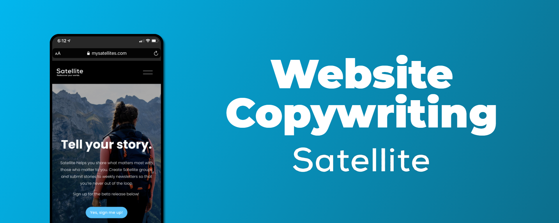
Copywriting
Satellite
The Challenge
Satellite was an early-stage startup offering a new social storytelling space to help people keep in touch. The challenge was to revamp the website copy across the main pages to bring it in line with the newly-defined brand voice of the company, to explain how the product works in simple yet compelling terms, and to effectively persuade the target persona to join the Satellite community.
The business goals were to increase conversions for the beta signup list and to bolster brand awareness by presenting a more consistent brand voice across touchpoints.
The Process
Collaborated with our business development team to better understand the needs, aspirations, and values of our core target audience
Consulted our analytics to understand the paths our users were taking to get to our primary conversion goal and the purpose of every page along the way.
Revamped the copy on each page making it more specific, clear, and compelling; infusing it with the brand’s voice; and ensuring it serves the business goals of each page.
The Copy Changes
Click to enlarge
Original Home Page
Headline could be more user-focused
Hero image is not in line with target audience
Body copy is technical and focuses more on what the process is rather than how it will benefit the user
The website uses two different terms for the main CTA (“early release” sign up and “beta” release sign up) which is potentially confusing for the user
CTA button is plain and not very active
Text link “Learn More About Satellite” is too general
Click to enlarge
New Home Page
Focused headline on the user by including “your”
Changed hero image to be more representational of the target audience
Simplified body copy and used more emotional language focused on the benefits to the user
Changed all CTA copy to consistently refer to “beta” release signup
Made CTA button more active and conversational
Made text link more specific to what is actually found on that page
Click to enlarge
Original About Page
Headline is a bit generic and could be more focused on the benefit
Text under heading could be more informative of what the tool actually is
Subheading does not match the content underneath
Page could be better optimized for scanning
Click to enlarge
New About Page
Tapped into an emotional benefit for the headline
Added a more detailed description of the offering under the headline
Changed the subheading to better represent the section underneath
Broke up the “How does it work?” section into three ideas to make the process clearer and fill in the gaps for scanners
Click to enlarge
Original Signup Page
Headline is generic and should focus on the benefit the user is about to receive
Subheading needs more personality and should reflect user’s state of mind
Button is too technical and robotic
Click to enlarge
New Signup Page
New headline taps into a sense of discovery and reinforces the main benefit
Infused subheading with more panache and included playful language to represent the excited and youthful dimensions of the brand voice
Subheading also recognizes the user as an early adopter taking a chance on a brand new social app
Button represents excitement and language is consistent with the CTA throughout the site
